

Minimalist kitchen countertops don’t have to be white. That’s the assumption most design guides lean on, and it leaves a lot of good options off the table. A minimalist countertop is really about controlled visual information: one material, one clear color direction and a pattern that doesn’t compete with the rest of the room.
Warm quartz, quiet granite and even a touch of natural stone movement can all read as calm when the details line up. This guide breaks down the materials, undertones, finishes and edge choices that create that clean, uncluttered feel without making your kitchen feel cold.
Minimalist Does Not Have to Mean Plain or All White
Do minimalist kitchens have to be white? No. White is one path to a calm kitchen, not the only one. A warm greige quartz, a soft taupe granite, or even a deep charcoal surface can feel just as restrained. The color just needs to stay consistent and the pattern needs to stay quiet.
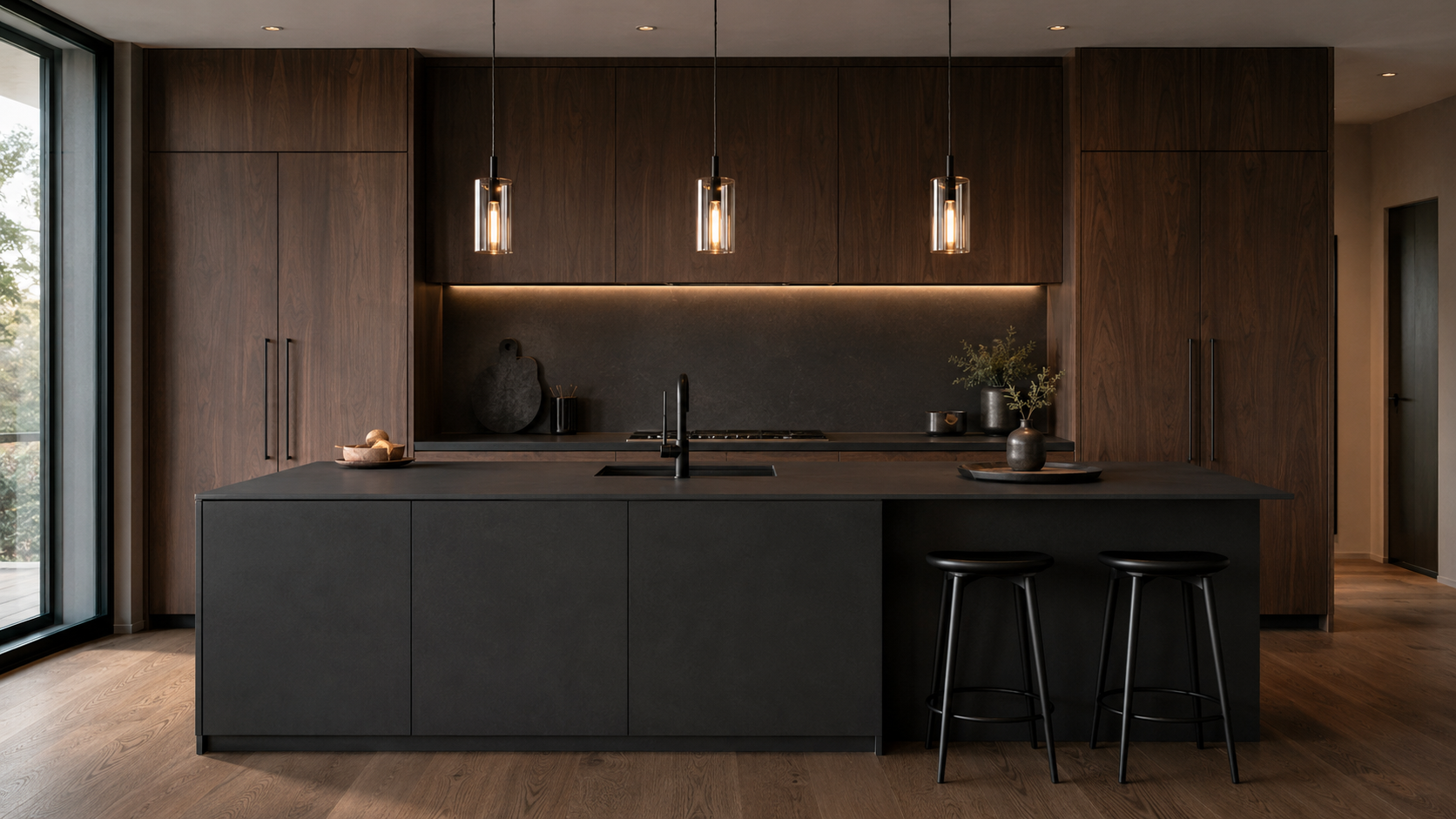
The mistake homeowners make is treating minimalism as a color rule instead of a design principle. Minimalism is about limiting visual competition, not limiting your palette. A dark countertop with a tight, even pattern can look more controlled than a busy white one with heavy veining running in every direction.
Warm minimalist kitchens: lean on wood tones, soft neutrals and countertops with warm undertones instead of stark white.
Dark minimalist kitchens: use a single deep tone, often paired with matte cabinetry, to create depth without visual noise.
Natural minimalist kitchens: allow some subtle veining or mineral movement, kept small in scale so it reads as texture rather than pattern.
Each direction works because it commits to one clear idea and carries it through the whole surface. That commitment, not the color itself, is what makes a kitchen feel calm.
Choose the Material Based on the Kind of Calm You Want
Every countertop material behaves differently. That shapes how minimalist your kitchen will actually feel day to day. Before picking a color, narrow the material family first, starting with where you land on natural stone and engineered surface differences. Each one delivers a different kind of visual calm and comes with its own care realities.
Quartz for Controlled Pattern and Color
Quartz is engineered, which means the color and pattern stay consistent from one end of the slab to the other. There is no unexpected variation to manage, which makes it a natural fit for minimalist design. Quartz does not need sealing. Day-to-day care is straightforward: wipe it down and move on with your day. The one tradeoff worth knowing is heat. Quartz can scorch or discolor if a hot pan sits directly on the surface, so a trivet is still a good habit even on a low-maintenance material.
Granite for Quiet Natural Character
Granite brings real mineral movement, but it can still support a minimalist look when the color is even and the pattern is fine. Granite is a natural stone, so no two slabs are identical. That means viewing the actual slab matters more here than with quartz. Granite performs well against heat and scratching, but it does need periodic sealing to protect against stains and moisture. That upkeep is manageable, but it is real, and it should factor into your decision.
Quartzite or Marble for Restrained Organic Movement
Quartzite and marble often get grouped together, but they are different materials with different care needs. Quartzite is harder and more heat resistant. Its movement can range from subtle to dramatic depending on the slab. Marble is softer. It etches from acidic foods like lemon juice or wine, and it will develop a patina over time even with regular sealing. Neither material is low maintenance. If you want that soft, organic movement in a minimalist kitchen, go in with clear eyes about the sealing and care both materials require.
Compact Surfaces for Thin-Looking, Performance-Driven Design
Compact surfaces offer a slim, thin look with strong performance against heat, scratching and UV exposure. That thinner profile can suit a minimalist kitchen well, especially on islands or waterfall applications where a lighter visual weight is the goal. Dekton is one option worth a look here, and why designers consider Dekton covers what sets it apart. Compact surfaces require specialized cutting and edge treatment, so fabrication should stay in the hands of a team with the right equipment and experience.
Let Undertones Do the Coordinating

“White” and “gray” are not specific enough to build a coordinated kitchen. Every neutral has an undertone, warm or cool. Matching that undertone to your cabinetry, flooring and hardware is what makes a minimalist kitchen feel intentional instead of accidental.
Warm wood cabinetry: pairs best with countertops that carry beige, cream or soft gold undertones rather than a stark cool white.
White cabinetry: works with almost any undertone. A warm white countertop keeps the kitchen from feeling clinical, while a cool white sharpens the look for a more modern edge.
Dark cabinetry: benefits from a countertop with enough contrast to read clearly, whether that is a warm cream or a cool, quiet gray.
Bring a cabinet door sample, a flooring swatch and a metal finish sample when you’re comparing countertop options. Undertones are hard to judge from memory, and they shift depending on the lighting around them.
Control the Amount and Scale of Veining
What countertop pattern works in a small minimalist kitchen? Generally, a nearly solid surface or a very fine, tight pattern. Larger patterns and bold directional veining need more square footage to breathe, and in a smaller kitchen they can start to feel busy rather than calm.
Pattern scale is one of the most overlooked decisions in minimalist design. A homeowner might fall in love with a dramatic, high-movement slab in a showroom sample. That same pattern can feel overwhelming once it covers an entire island. The scale of the pattern needs to match the scale of the room.
There are three general directions to choose from:
Nearly solid: the quietest option, with little to no visible movement, best for homeowners who want zero visual distraction.
Fine veining: subtle, tight movement that adds texture without pulling focus, a common middle ground for minimalist kitchens.
Directional movement: more pronounced veining that flows in one clear direction. It can still work in a minimalist kitchen if the layout is planned so the pattern lines up across seams instead of fighting itself.
This is where a full slab and digital layout tools matter. A two-inch sample cannot show how a pattern will actually move across a ten-foot island.
Choose a Finish That Fits the Light and the Routine
Polished, honed and matte finishes all change how a countertop reads in a room. Finish does not change the underlying material’s care requirements. A honed granite still needs sealing. A matte quartz still needs a trivet under hot pans.
Polished finishes reflect the most light. That can make a small kitchen feel brighter and more open, and that reflective surface also tends to keep fingerprints and water spots from standing out as much day to day.
Honed finishes have a soft, low-sheen look that many homeowners associate with a minimalist style, but that same lack of shine means fingerprints, oils and water spots tend to show up more readily than they would on a polished surface. Matte finishes push that further. They offer the least shine, and on many materials, they show fingerprints and smudging more prominently, not less.